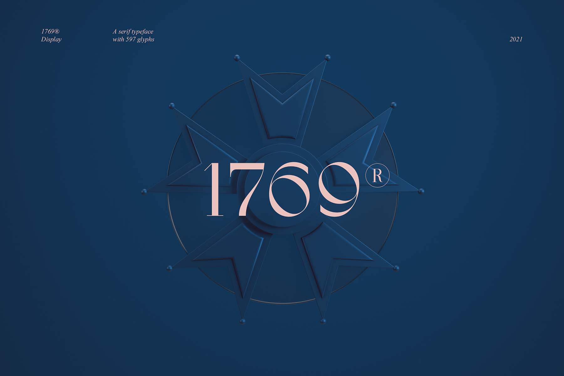
1769® Display
Want to buy the family one?
To download the demo version, you need to create an account and download from it.
Do you have a merchandising project? Contact us to confirm the use and price of typography.
- 1769
1769® Display – Untouched ancient curves preserved in memories.
Elegant as an 18th century feather throw, 1769® Display is harmoniously inspired by the handwritten curves of the Romantic movement of the time. It also announces the birth of Napoleon Bonaparte, an emperor as fascinating as it was repulsive but, without a doubt, an emblematic figure of those times. The delicacy and roundness of its ligatures are a symbol of grace, sensitivity and nobility. 1769® Display is, on its own, a faithful transcription of an important part of the history of France, its culture and its rich heritage. It is with a modern look that we update this old style with an inked beak depositing bold and contrasting fills on thick paper. 1769® Display is a well-cut classic. Its “C” full of class and its “A” charismatic, an alphabet thought out like an architect, it is the announcement of a Revolution.
1769® Display – Inspired by vintage didones.
First carved in stone by the Romans to take advantage of the reflection of light in typographic grooves, serifs were at the heart of all typefaces used in printing. The didones will reign over the 19th century and agree the description of characters “à la française”. They are printed on laid paper, in the middle of the stretch marks of the transparent screen, using a fast drying ink. Burrs are prohibited by their delicacy. They will be abandoned when the screens arrive because of their exaggerated finesse. The poor quality computer display erases the discreet hairlines of the didones. Their perfect linearity and the aliasing caused by the pixels do not match. We will wait several years before observing their great return.
Use
Friend of the traditional “French-style” sewn binding, 1769® Display also adapts to your visual identities. A touch of charm and finesse to make your designs a reflection of your mastery. The Parisian, the classic, the classy. Her cousin Bodoni is already the ambassador of glossy fashion magazines, of the canons of beauty and even of Nirvana (rock’n’roll and nobility are ultimately not opposites). Between haute couture refinement and American grunge, elegance makes its place as an ideology and a strength of spirit. Finally, 1769® Display could quickly become the new symbol of chic.
And also
What if we found it more impactful? Less discreet? The Kassi® is the quintessential eccentric typography, it can be seen, it knows it and it says it. I’m looking for a charismatic typo.
Supported languages
Afrikaans, Albanian, Asu, Basque, Bemba, Bena, Breton, Catalan, Chiga, Colognian, Cornish, Croatian, Czech, Danish, Dutch, Embu, English, Esperanto, Estonian, Faroese, Filipino, Finnish, French, Friulian, Galician, Ganda, German, Gusii, Hungarian, Inari Sami, Indonesian, Irish, Italian, Jola-Fonyi, Kabuverdianu, Kalenjin, Kamba, Kikuyu, Kinyarwanda, Latvian, Lithuanian, Lower Sorbian, Luo, Luxembourgish, Luyia, Machame, Makhuwa-Meetto, Makonde, Malagasy, Maltese, Manx, Meru, Morisyen, Northern Sami, Northern Ndebele, Norwegian Bokmål, Norwegian Nynorsk, Nyankole, Oromo, Polish, Portuguese, Quechua, Romanian, Romansh, Rombo, Rundi, Rwa, Samburu, Sango, Sangu, Scottish Gaelic, Sena, Serbian, Shambala, Shona, Slovak, Soga, Somali, Spanish, Swahili, Swedish, Swiss German, Taita, Teso, Turkish, Upper Sorbian, Uzbek (Latin), Volapük, Vunjo, Walser, Welsh, West Frisian, Zulu.
Credits & details
1 Style
Type Designer : Jérémie Gauthier
Art Direction : Jérémie Gauthier & Romain Billaud
Release date : 2021
Version : 1.0
Formats : OTF, WOFF, WOFF2